HappierWork - User Experience Design
Product Design, Interaction Design, Information Design

Project Overview
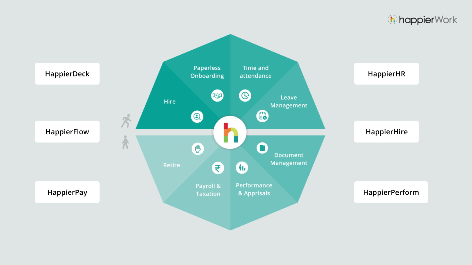
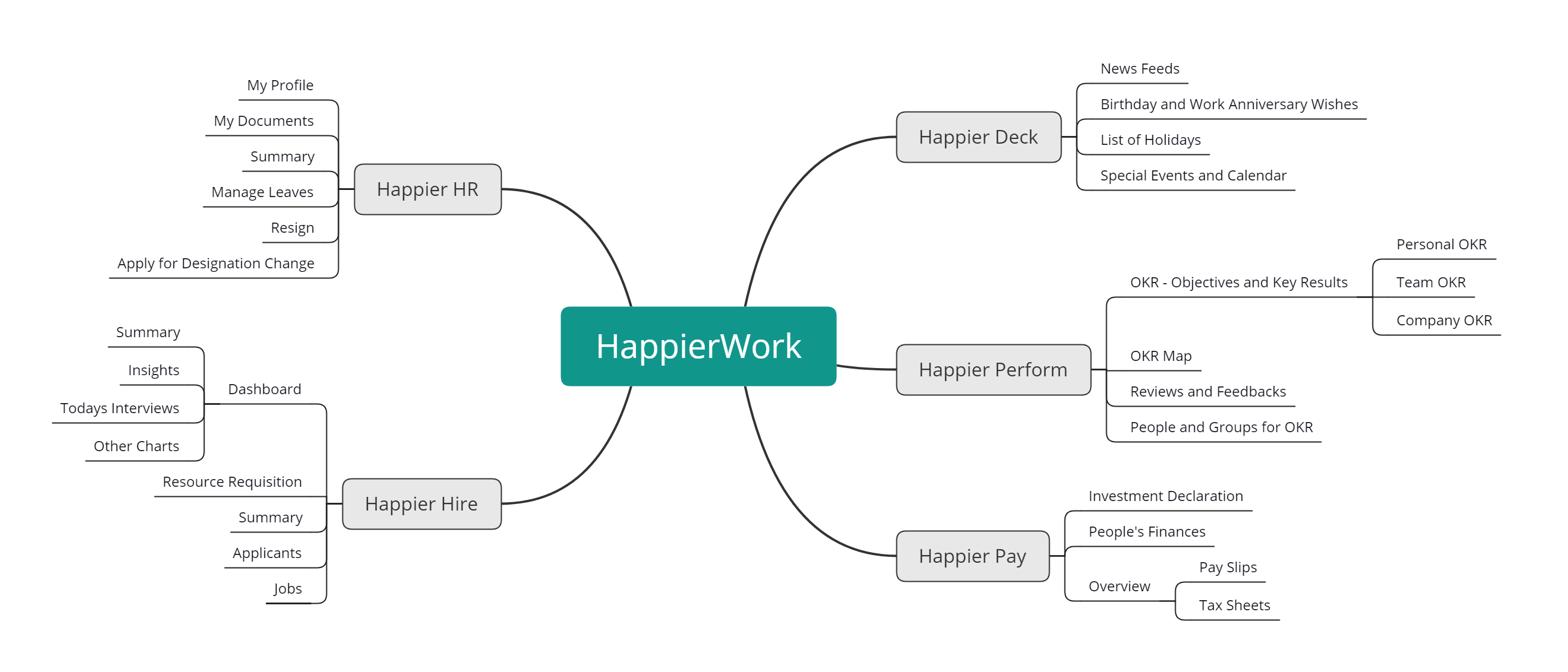
HappierWork is an emerging cloud-based Human Resource Management System (HRMS). It is a family of different application — Happier HR, HappierHire, HappierPay, HappierPerform, HappierBot etc.
My role as User Experience Designer of HappierWork involved advocating the end user’s experience by creating meaningful concepts and interactions and crafting interfaces that make HappierWork easy to use for users like HR Mangers, Executives, Product Managers and Employees.
During the period of 9 months working as full time UX Designer, I was closely collaborating with Product Managers, Software Engineers and other design colleague to shape the product which is currently being used by companies like Mapro, Royal Enfield and Searce etc.
Involvement
User Studies, Ideation, Information Architecture, Interface Design, Interaction Design
Duration
9 Months (May 2019 – Jan 2019)
Tools
Sketch, Adobe Creative Suite
Platform
Deskop Application, Android/iOS Application
Design Briefs
During the time of 9 months I got chance to work on multiple design briefs and problem statements -
1. Deigning the OKR (Objectives and Key Results) Dashboard for HappierPerform, which involved taking usability tests and suggests better alternatives wherever required.2. Re-designing the user flow for Investment Declaration feature for HappierPay.
3. Designing the Dashboard Experience for HappierHire App to make it easy for hiring managers to take decisions.
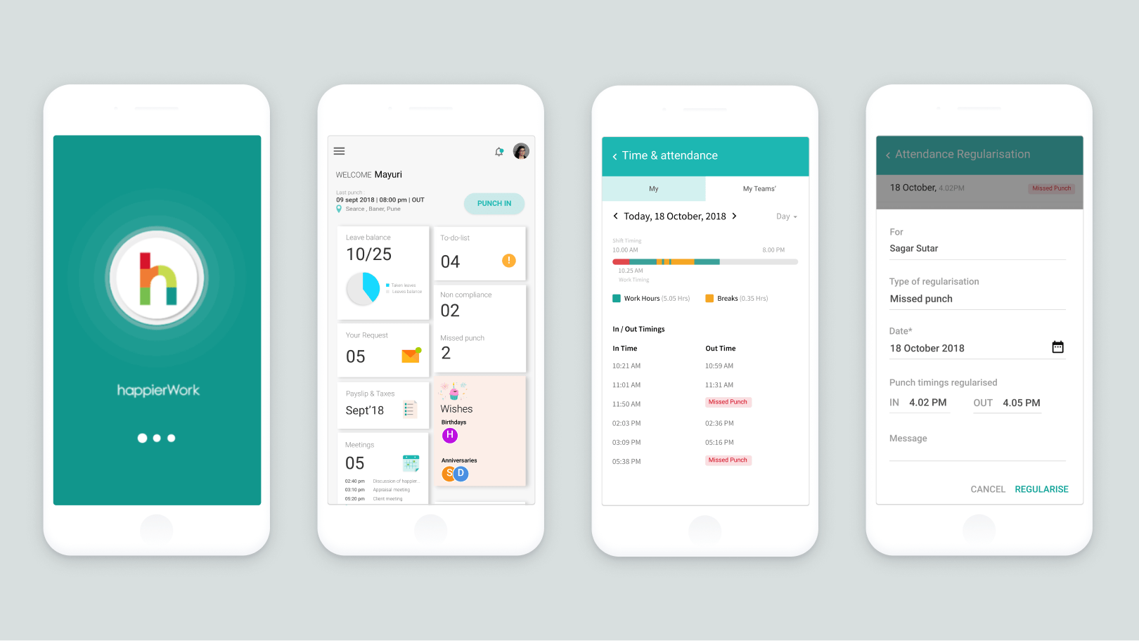
4. Designing the HappierWork Android/iOS application.
Research – Understanding the Context and Users
HappierWork as a cloud based ERP is primarily used by employees of company and HR Managers to manage their work in day to day life. The product is integrated with G-suite and every employee gets an access to this product when they join the organisation using happierWork. From this app employees an manage their leaves, documents and other HR-related activities.
HappierPerform is performance management app through which every employee can keep track of their assigned objectives. HappierPay handles payment and appraisals of employee. Happier Hire is primarily used by HR managers and Talent acquisition teams to post and manage hiring needs. All happierApps are seamlessly integrated with each other and with G-Suite.
HappierWork takes care of everything, from Hire-to-Retire
HappierWork takes care of everything, from Hire-to-Retire
User Research and Analysis
To design the right experience, I started by understanding the potential users, the way they interact with happierWork, their primary needs, their pain points in existing user.
After gaining overview of product from BA, product managers, QA and other colleagues. I interviewed couple of HR managers, few employees within our organisation. Most of the people use the web application to accomplish their HR related needs, like managing their leaves, uploading required documents, check out holidays, understand and monitor their work hours etc. For some employees, like sales employees it becomes difficult to manage their in/out timing as they do not get access to their account outside of an organisation.
For some users like HR it becomes difficult to manage interviews as the current interface is not much insightful. For some HR managers the aesthetics of the interface was major concern, they considered “not-a-good-looking” interface as bad experience.
From such insights, I came up with some questions to frame my ideation:
How can we design a painless and decent experience, in given time? How can we design an experience over smartphones both android and iOS? What can be done to make dashboard for HR to make more insightful? How Investment declaration can be made much easier for users?Persona
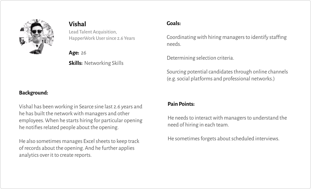
From the user research, I built personas to highlight needs, motivations and goals of different type of users and further used these personas in ideation and designing user flows.

Insights
We were able to derive following insights fro mour initial research and feedback from users
1. HappierPerform – The existing dashboard had lot of usability issues and usability patterns needs to be consistent with other apps in HappierWork family.2. HappierPay – It becomes difficult for people to search for type of investment and get an overview of complete investment done. So investment declaration dashboard needs to be more informative and need to made simple.
3. HappierHire – For HR people they need to get overview of number and types of opening in an organisation. They also need to schedule/reschedule and see today’s interviews.
4. For sales people they need an smartphone application that can give access to people outside organisation.
Ideation
From the user research and insights we came up with following ideas to address the needs and problems user were facing —
1. Creating the dashboard for happier perform from where managers can define OKRs and employees can track their day to day OKRs2. Simplifying the Investment declaration flow for the users.
3. Redesigning the Happier Hire dashboard for the HR people to make it more insightful and informative.
4. Designing the HappierWork Smartphone application.
Information Architecture
With some initial ideation done, the next stage was structuring the information. Most of the structure of HappierWork was already defined, but I did this exercise of defining the IA for happierWork for better understanding the information flow. This further helped us to redefine the information flow, wherever needed.
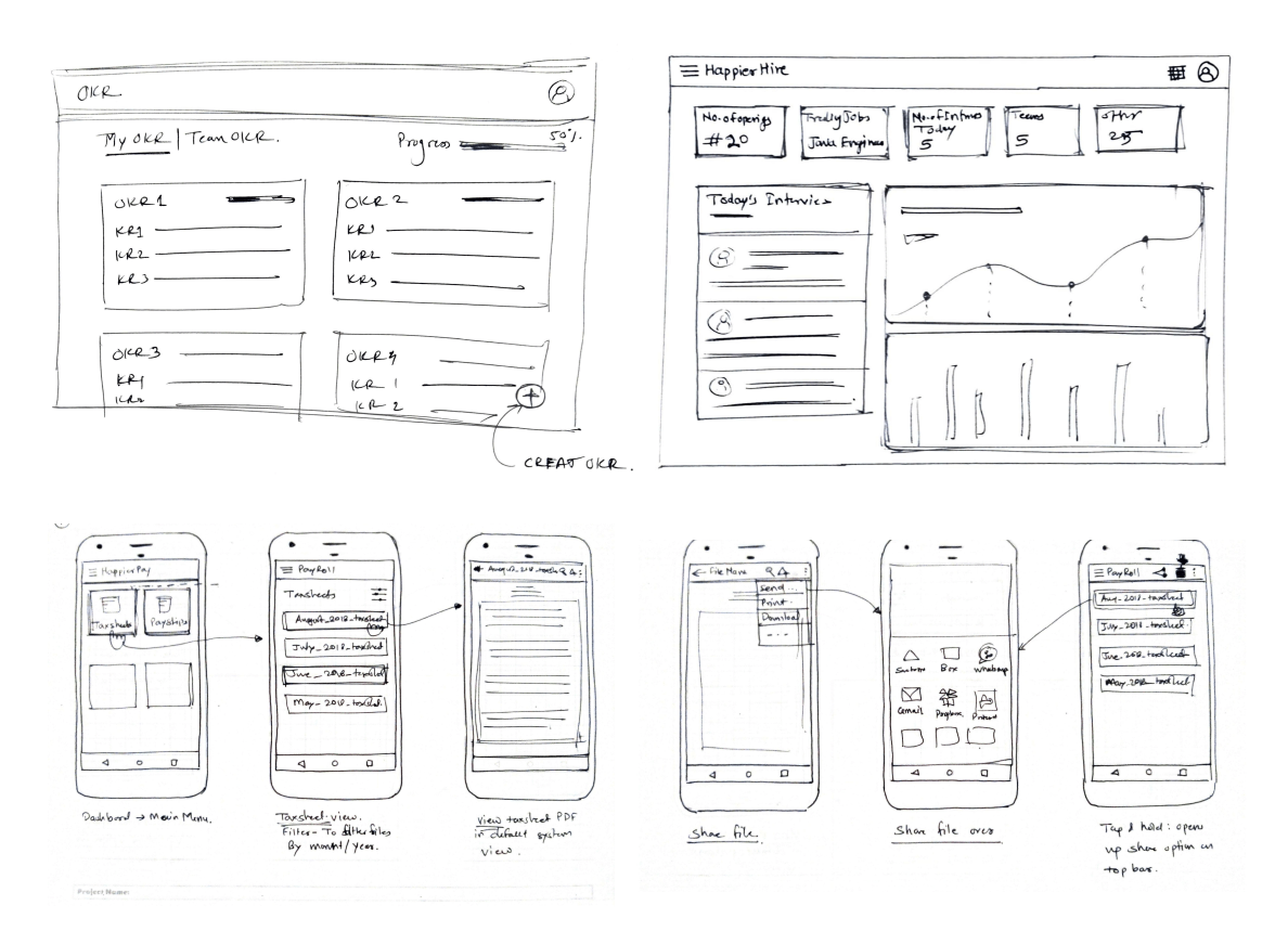
At a next stage, we designed rough wireframe from the identified information architecture. Although I am not able to share every details for each type of user, below are few wireframes that we designed for HappierPay and HappierHire.
Wireframes
Following are some of the wireframes that we initially designed after ideation and after understanding the information architecture. We performed many iterations to comeup with in detailed wireframes so as to save our efforts in re-designing final visual design.