The MPSC Library - Interface Design
Interface Design, Interaction Design, Visual Design
Project Overview
The MPSC Library is a smartphone application created by EasyPadhai — an educational startup based in Pune, India. It intends to bring the library experience on to the smartphone application for the MPSC students.
My role as a designer for this application involved designing information architecture, user flows, visual designs.
My Responsibilities
Information Architecture, Interface Design, Interaction Design
Duration
3 Months (Sept 2019 – Nov 2019)
Design Tools
Figma, Zeplin, Whimsical
Platform
Android OS
Design Brief
Veetrag - the founder of Easypadhai approached me one day with the concept for this app. He was looking for a designer to work on the user interface design of this app.
The brief was to realize this concept with primary focus on the book reading experience.
Understanding the Users
Conceptually this app is intended to help people who are actively preparing for the MPSC (Maharashtra Public Service Commission) exams. The typical persona of these users look like below -
- Most of these users speak and study in the Marathi Language.
- Users include - fresh graduates from various educational backgrounds, part-time workers, housewives etc.
- Most of such students attend private libraries situated around the city. These libraries offer different resources - books, internet and isolated space to study.
- Many of the people appearing to these exams work part-time, hence do not have access to above-mentioned resources.
Veetrag had come up with the concept for this app after this research.
Information Design (Information Architecture, User Flows)
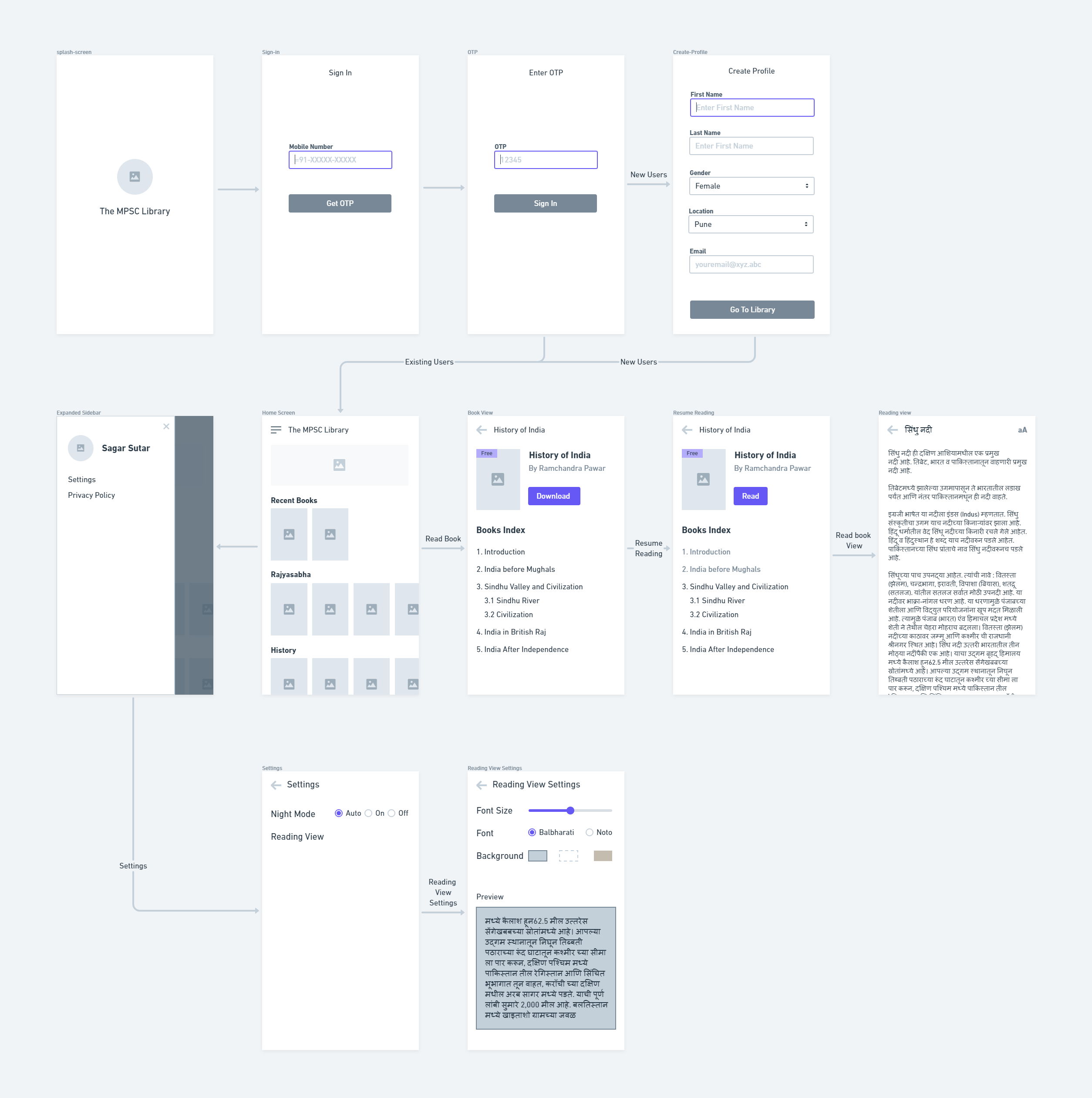
As a first step, we quickly drew wireframes to visualize information architecture that can address the above-mentioned insights. It gave us a clear idea of the complexity of the app. It also helped us to understand different features and their priority.
Interface Design
We collaborated to address three objectives through visual design
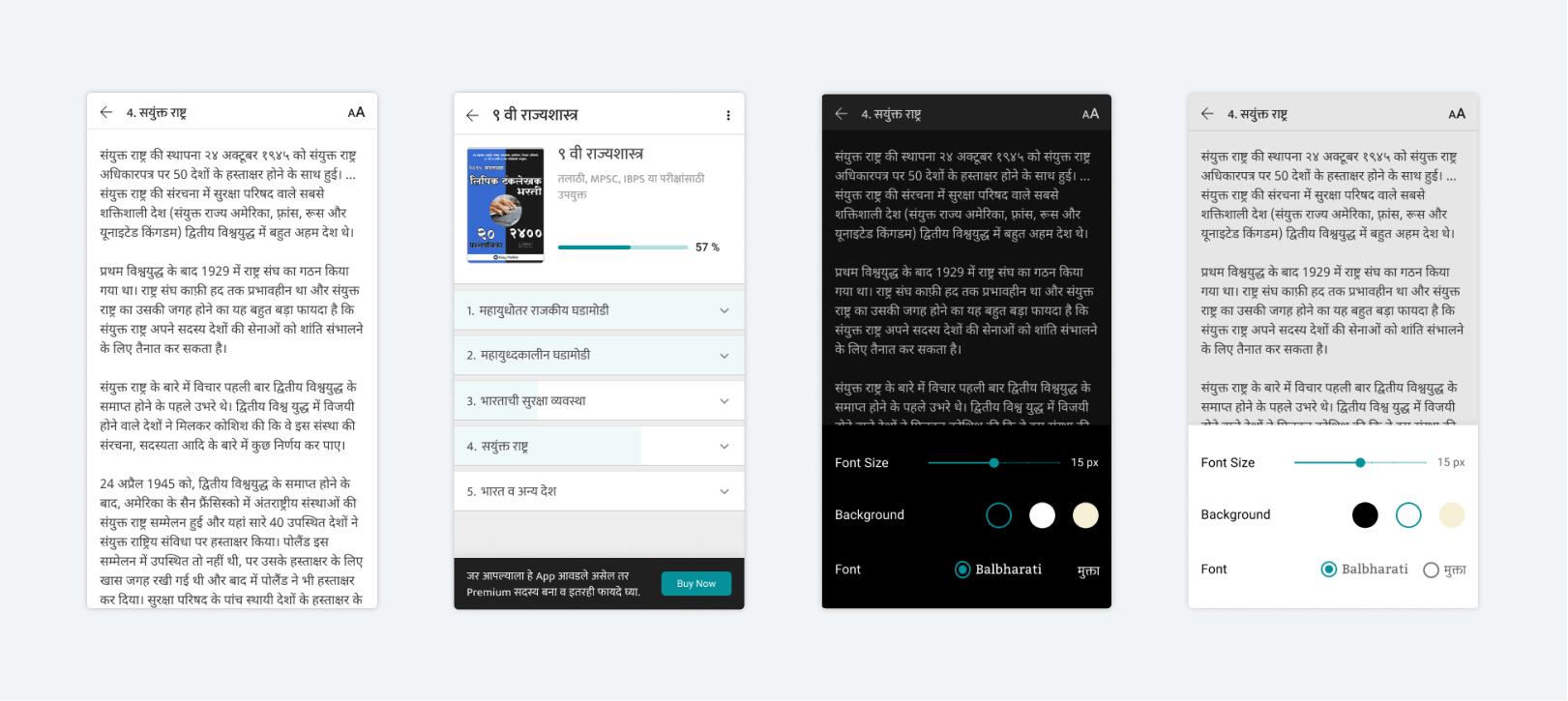
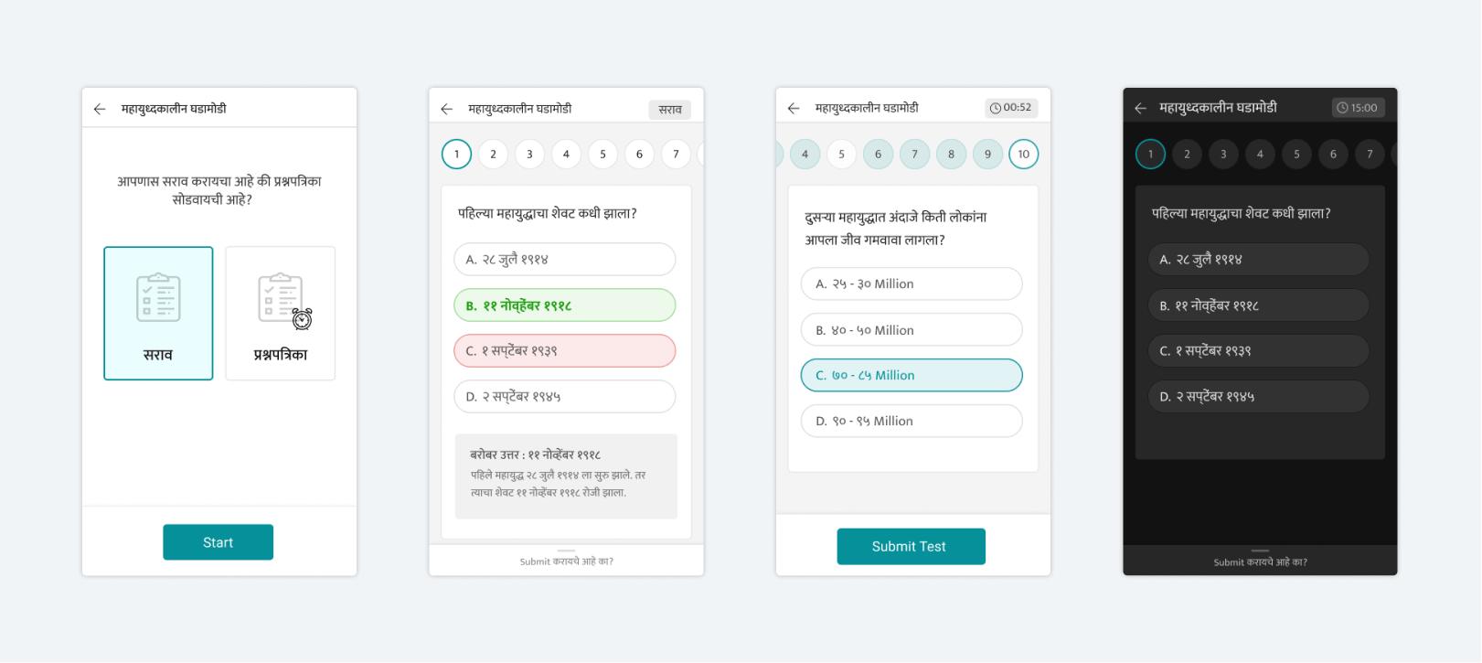
- Designing a smooth and strain-free reading experience, as people are going to use this app for a long time.
- Designing the interface that is simple enough to adapt to the new app without many efforts
- The interface that addresses business needs — free and premium books.
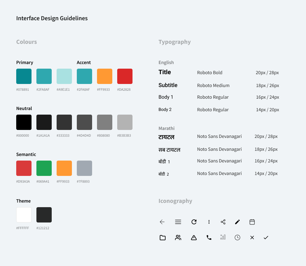
Colours and Typography
UI guidelines were defined to override the colour, font and icons of default Material Design System by Google.
- Primary Color is derived from Easy Padhai's Brand colour.
- As most of the people speak and study in Marathi, we decided to use “Noto Sans Devanagari” as default Marathi font which is available across all android devices freely.
- Icons designed custom icons wherever required.
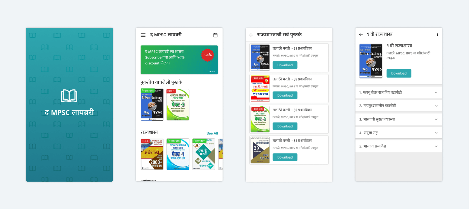
Visual Design
After multiple iterations and feedback sessions, we came up with final visual designs.
Interaction Design
We used prototyping features of Figma to communicate interactions used in this design to provide a smooth reading experience.
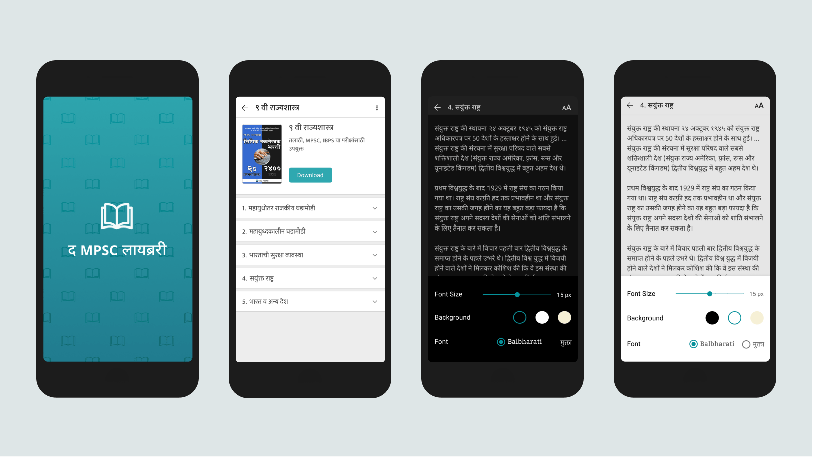
We particularly focused on the interactions of the reading view, where users are supposed to spend most of their time. It was necessary to clearly communicate this experience of how font, sizes and colour transitions shape reading experience.
Learnings
It was a good opportunity to work with Veetrag and Easypadhai after a long time. We were able to create an intended experience. We learned about importance of a good visual design in creating a smartphone application.
Credits
Veetrag Lodha and Priyanka Chordiya
Live in Store
This application is live in Android Play Studio and receiving a good response from the MPSC students.